CannaThis
Logo Design
Ren worked to create a simplified logo for the cannabis-infused soda brand, looking to evoke the feeling of non-infused sodas that customers would have recognition of. CannaThis sought to evoke nostalgia and approachability with the redesign and all other pieces of content created.
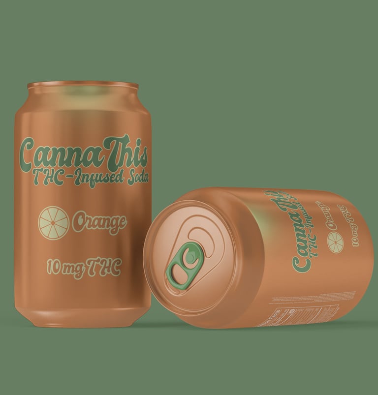
Packaging Design
To keep the requested feeling of nostalgia and the approachability factor, Ren worked to create a stripped down soda can inspired by the flavor of the soda itself.
By keeping the orange color on all faces of the can - including the traditionally silver-colored top and bottom - and pulling green from orange trees and cannabis, Ren created a can that is easy to understand at a glance and evokes a sense of familiarity that even consumers new to the market will feel.
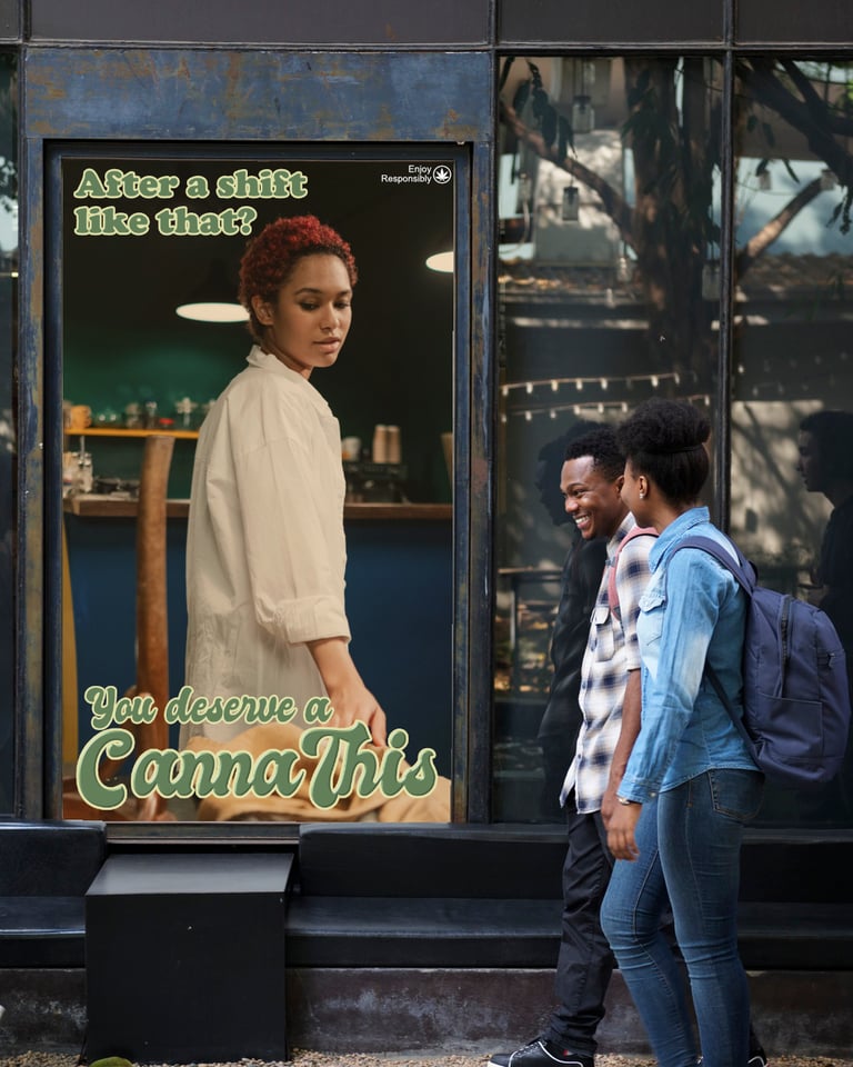
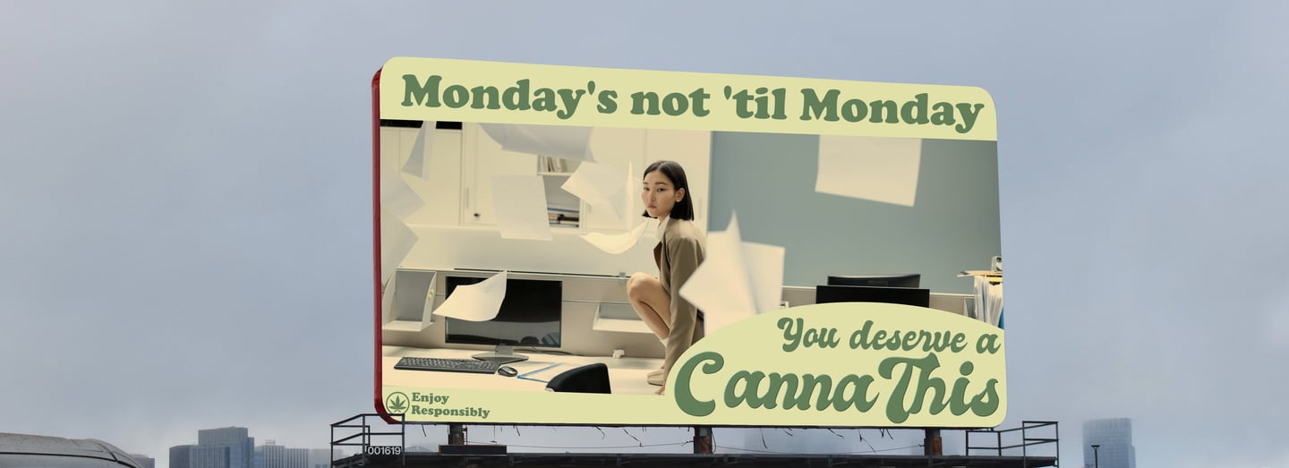
OOH Concepts
Ren created two OOH marketing concepts for the brand as part of a campaign to expand the client’s potential audience. The focus was on showing everyday commuters that they deserve to relax and unwind with a fun, delicious, THC-infused soda just as much as anyone else.
The tagline Ren created, “You deserve a CannaThis,” stemmed from the idea of showing business professionals, service workers, blue-collar workers, and anyone else that they are not excluded from the cannabis industry just because of their profession.
(CannaThis is a fictional brand and all work shown is proof-of-concept)